Sheldon.studio srl
Via dei Portici, 70
39100 - Bozen-Bolzano, IT
PI 03061940213
If we are not counted, how do we count?. Client: Fight The Stroke. Year: 2023. Categories: NGOs, statistical offices, research institutions, dashboards. What are the consequences when a country's data strategy ignores certain categories, such as minorities or more vulnerable people?
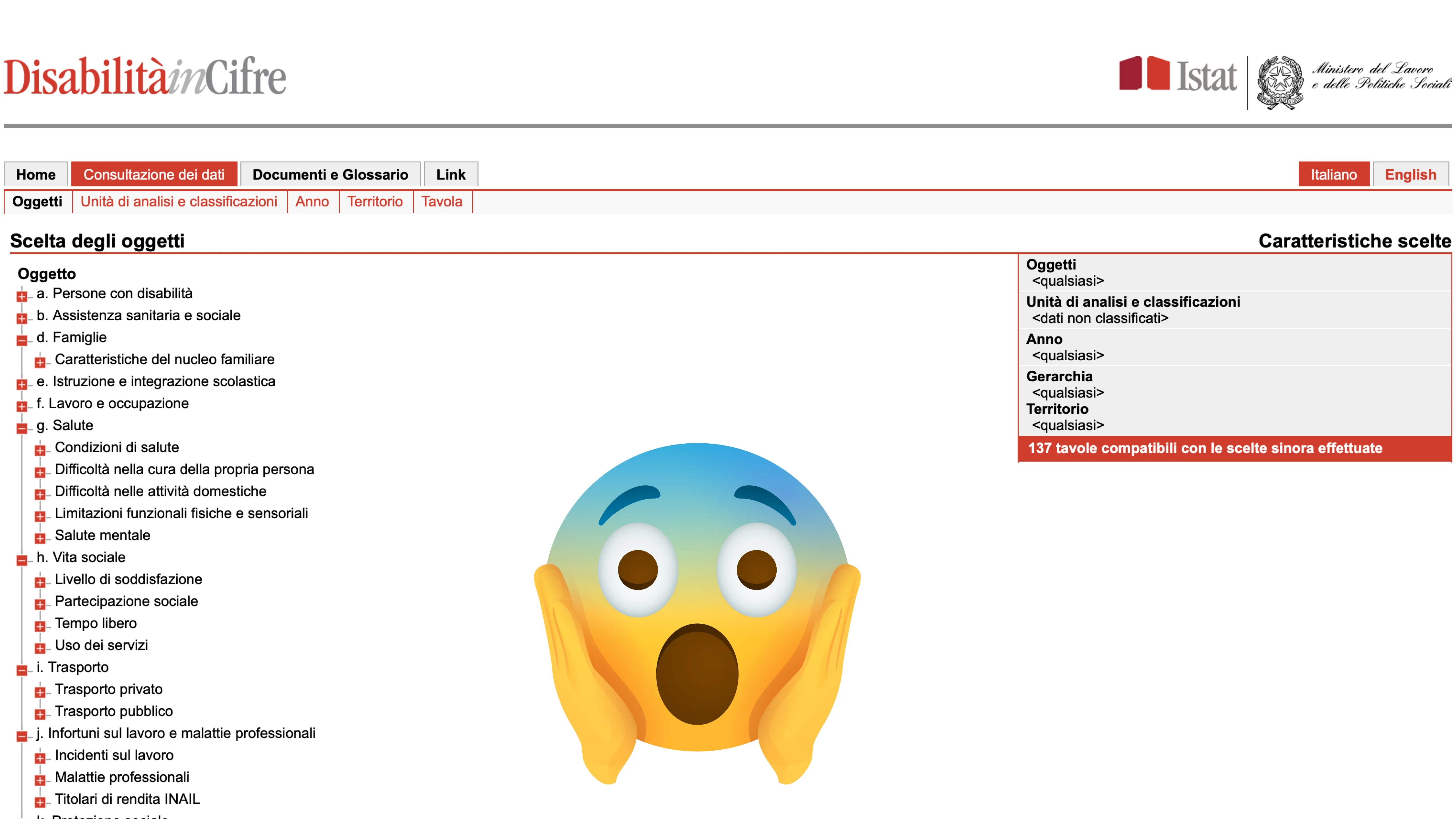
National data on disability (below) is often discontinued, inconsistent, not machine readable, and collected through sample surveys. Such unstructured process leads to approximate and wildly inaccurate figures. In addition, it is quite inaccessible: we calculated that to reconstruct a single dataset you need an average of 85 clicks and the download of 20 tables. Accessibility is not just meeting web standards, but making resources truly accessible to those who need them.
Disabled Data makes all the data available in a click. Thanks to the contribution of onData, we were able to think about how to make the data available to a broader audience, and above all, to imagine how the project could foster a debate about the more accurate collection and systematisation of data by national bodies.

Due to the discontinuous nature of the data, it was impossible to imagine a contiguous and interconnected dashboard. So we thought of returning as many facets as possible, displaying individual widgets, each telling a specific story, to cover all the possible sides of the complexity involved in the phenomenon.
Each data if finally visible, easy to understand, and intuitive to download. In a few clicks, the data visualizations can also be downloaded, or shared on one's own platforms. Disabled Data is a new tool at disposal to support the work of journalist, policy makers, social worker, but also media producers and creators, to populate the internet with meaningful and informed content.
We considered accessibility from the point of view of charts as well. According to our preliminary research, very few projects support the translation of a graphic for visually-impaired users. Building upon that, we designed an algorithm to automate descriptive texts based on the graph data. The picture below shows the chart on the left and the text that screen readers narrate to describe it.
Follow us on
Instagram
LinkedIn
Spotify
Medium